SurfSideSafe New Feature: Say Goodbye to Ugly Links and Hello to Clean, Clickable Posts! |
 SurfSideSafe
Have you ever come across a post where the link stretches across the screen, breaking the flow and making the content hard to read? This is something that will definitely break your spirit.
It doesn't look very good. But this is all behind you now. We've found a better way.
Now, when you include a URL in your post on SurfSideSafe, it won't appear as a long, messy string of characters. Instead, it's replaced with a simple, elegant message:
Read more ➢
Not only does this look clean and professional, but it also makes your post more inviting and easier to engage with. Users can simply click the "Read more ➢" link to see the content without being distracted by the clutter of a plain URL.
And let's face it: Some URLs can get pretty ugly. We wouldn't think of doing anything that would ever take away the style, class and grace from your timeline.
We didn't stop there. We also re-thought about how longer posts with links are displayed.
On SurfSideSafe, posts with links will no longer include an extra "Read more" button for lengthy content. Why? Because we want every post to display perfectly and without redundancy.
This subtle change keeps your timeline looking neat and ensures that every post delivers its message in the clearest way possible.
You might be wondering why we've spent time refining such a small detail. It's simple: we care about our users.
At SurfSideSafe, we understand that even the smallest changes can have the biggest impact on how you share and consume content.
We want SurfSideSafe to be as close to perfect as possible!
This is the only way we will have it!
Other platforms may overlook these details, but not us.
We're building SurfSideSafe to be the best social media platform in the world, and that means making sure each and every part of your experience is exceptional —- even the little things like how links appear in your posts.
At SurfSideSafe, we don't just aim to connect people. We strive to create a space that feels fun, welcoming, and easy to use.
By focusing on features like this, we're showing that we're not just another social media platform —- we're one that listens to its users and takes action to improve their experience.
Other platforms might not think twice about showing cluttered links, but we know our users deserve better. It's this attention to detail that sets SurfSideSafe apart.

We're constantly working to make SurfSideSafe better for you. From our cutting-edge features to the small tweaks that make a big difference, we're committed to creating a platform where you feel at home.
If you're tired of cluttered timelines, uninspired features, and platforms that don't seem to care, it's time to make the switch. Sign up for SurfSideSafe today and see what it's like to be a part of something special -- a social media platform that puts you first.
Experience the clean, user-friendly approach to social media —- one where even the smallest details are designed with you in mind.
Join SurfSideSafe now and see the difference!
AND:
Remember! At SurfSideSafe, we are here to make your life much better.
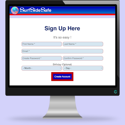
Join SurfSideSafeCreating an account with SurfSideSafe is very easy.In a few minutes, you will have the best Social Media experience you have ever had in your life.  |

A calmer, safer, easier place to connect

Creating an account with SurfSideSafe is very easy.
In a few minutes, you will have the best Social Media experience you have ever had in your life.
